La Sovrana’s New Identity
Unmistakably Italian.
Bringing Italy to London through a brand that feels proudly Italian yet unmistakably modern, expressive, grounded and full of character.
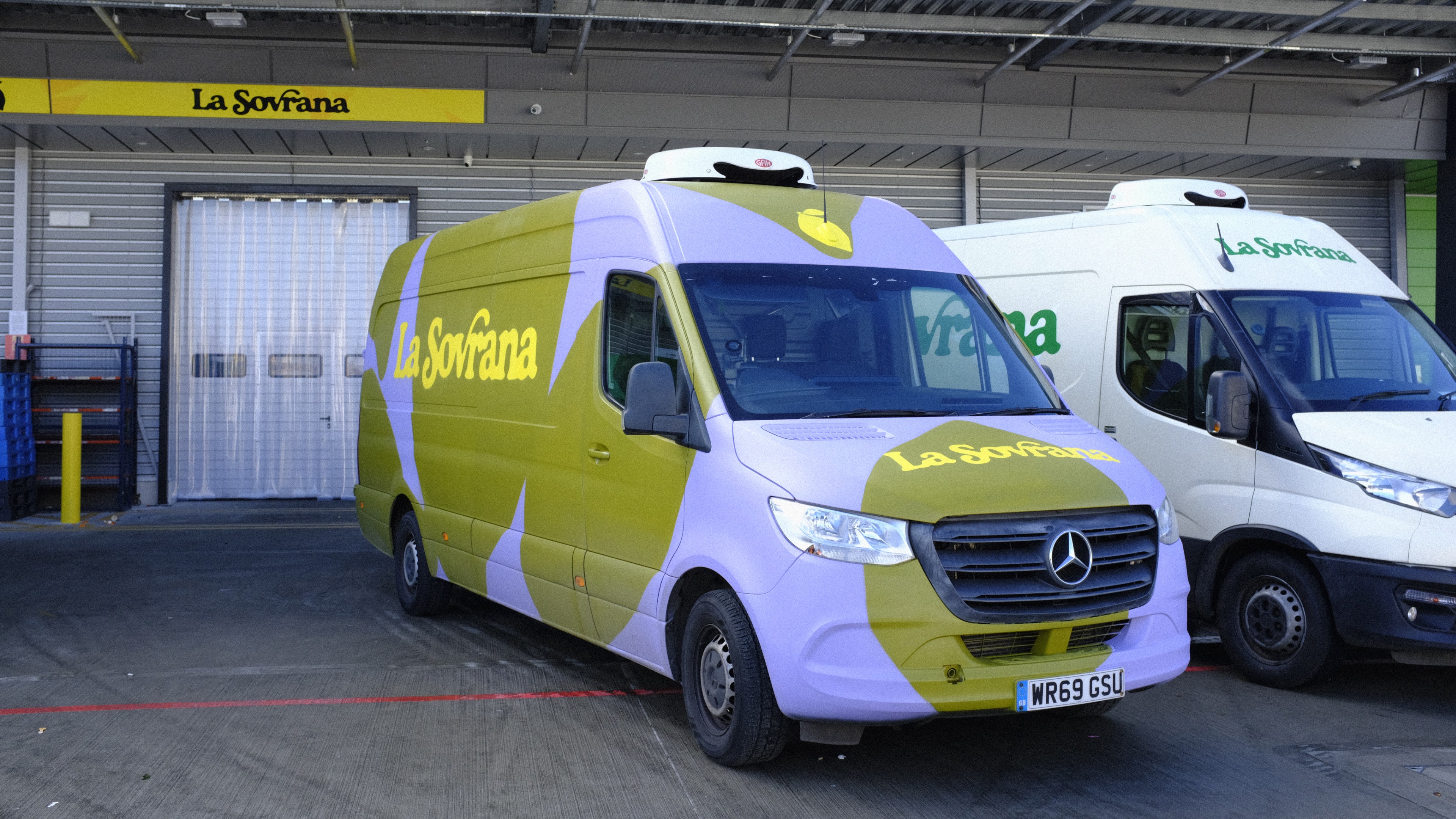
This rebrand arrives at a pivotal moment for La Sovrana. Alongside the new visual identity, the business has invested in a brand-new warehouse and an expanding fleet of branded vans, bringing its renewed presence into the everyday fabric of London. These are not just operational upgrades; they are physical proof of momentum.
At Justified, we have always believed that great branding is not just about looking good; it is about being strategically sound. It should reflect a deeper truth about a business, the way it works, and why it exists. Since 2017, La Sovrana has been bringing some of Italy’s finest, seasonally grown fruit and vegetables to London markets. Founded and led by brothers Alfonso and Pierpaolo Picaro, the business is grounded in knowledge passed down through generations and a relentless commitment to quality. Their approach, thoughtful, patient and deeply intentional, stands in contrast to a food system dominated by convenience and predictability.
What we found most inspiring was how that philosophy creates a brand that does not fit the typical wholesaler mould. Their previous visual identity, however, did not reflect that character or warmth. It was time for something that could carry La Sovrana into its next chapter, and communicate the richness of their way of working.
La Sovrana's new warehouse at New Covent Garden Market.
“For us, this project was a reminder that authentic branding comes from listening closely to the people and processes that make a business unique. La Sovrana’s identity is not built on abstraction; it is rooted in lived experience.”Joshua Ogden - Creative Director

A Brand Identity that Feels Like Italy
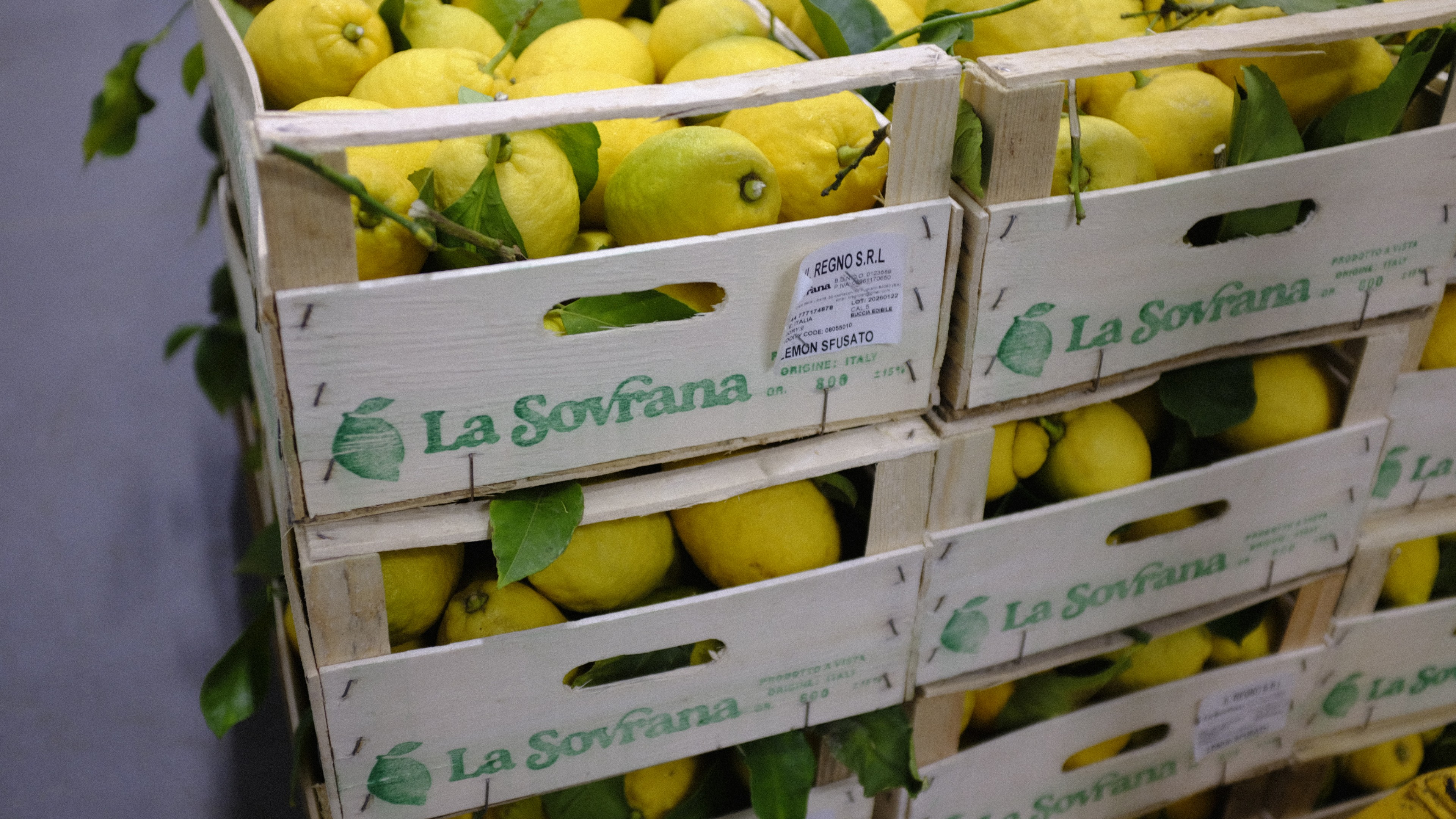
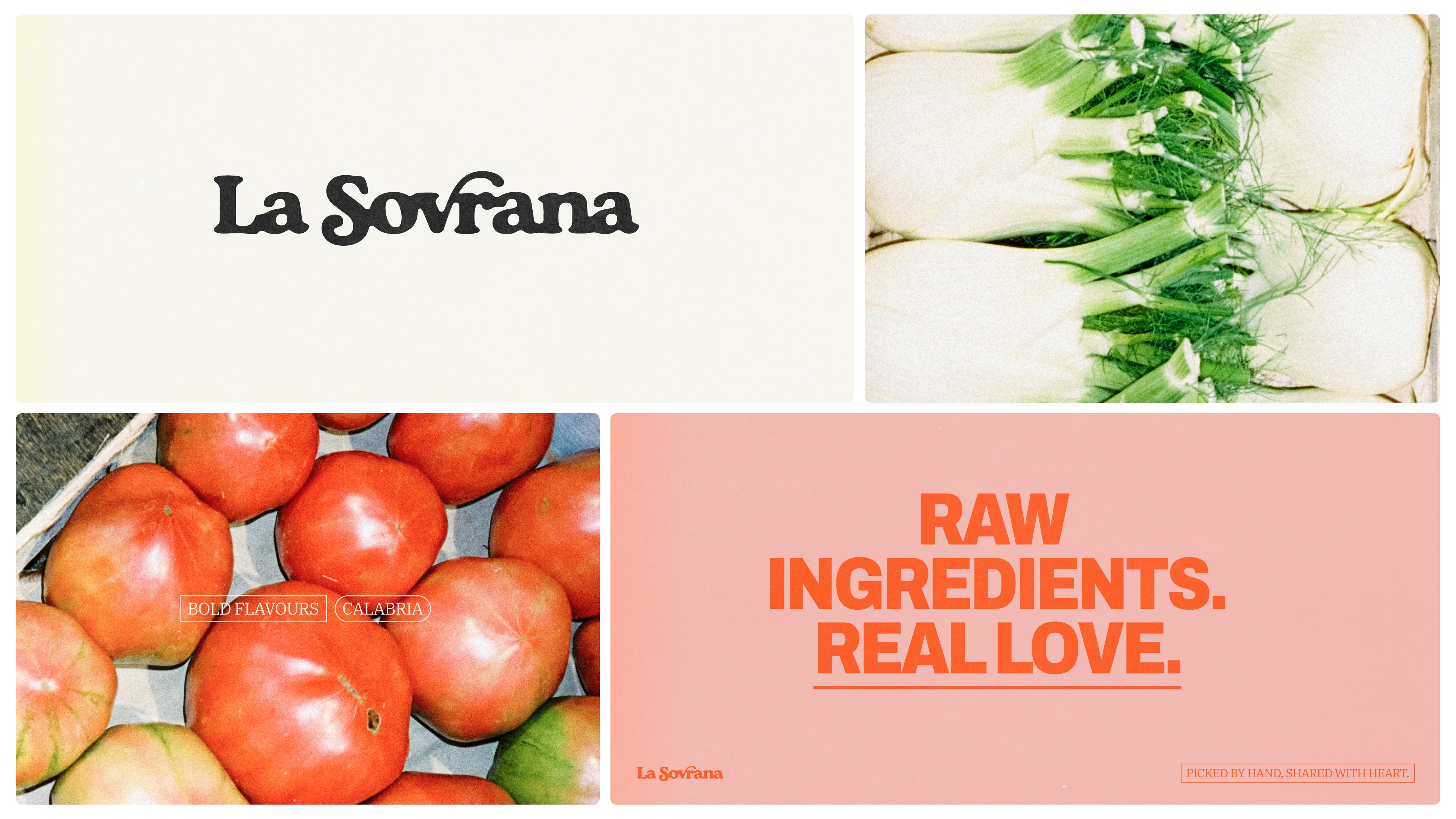
At the core of the new identity is a bespoke wordmark, a thick, characterful serif that feels welcoming. It draws inspiration from the typography found on produce boxes, fruit stickers and everyday Southern Italian graphics that caught our eye during visits to La Sovrana’s spaces.
Its custom shapes, the close-knit letterforms, the flourish of the “S” and “V”, are rooted in the tactile beauty of printed ink and cardboard. The result is something familiar and trustworthy, like the label on a perfect piece of fruit.
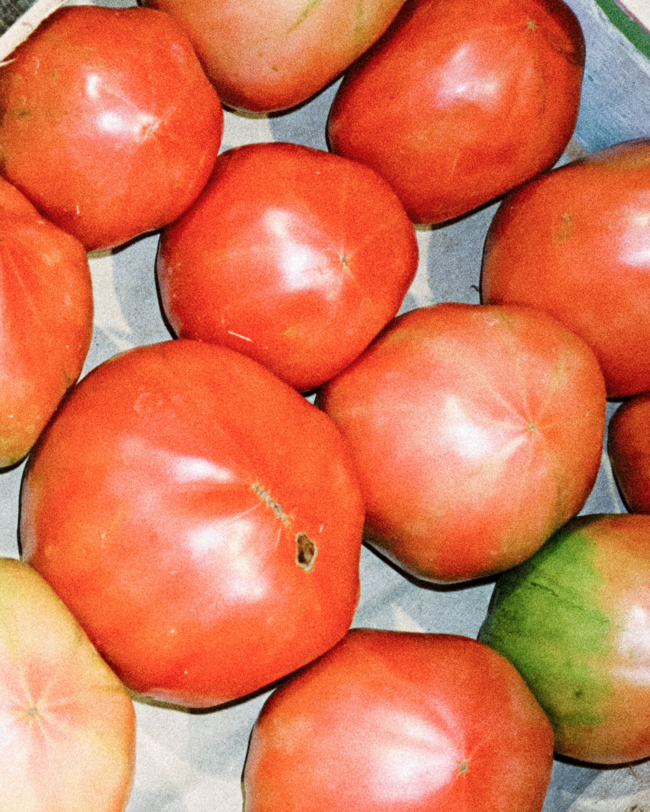
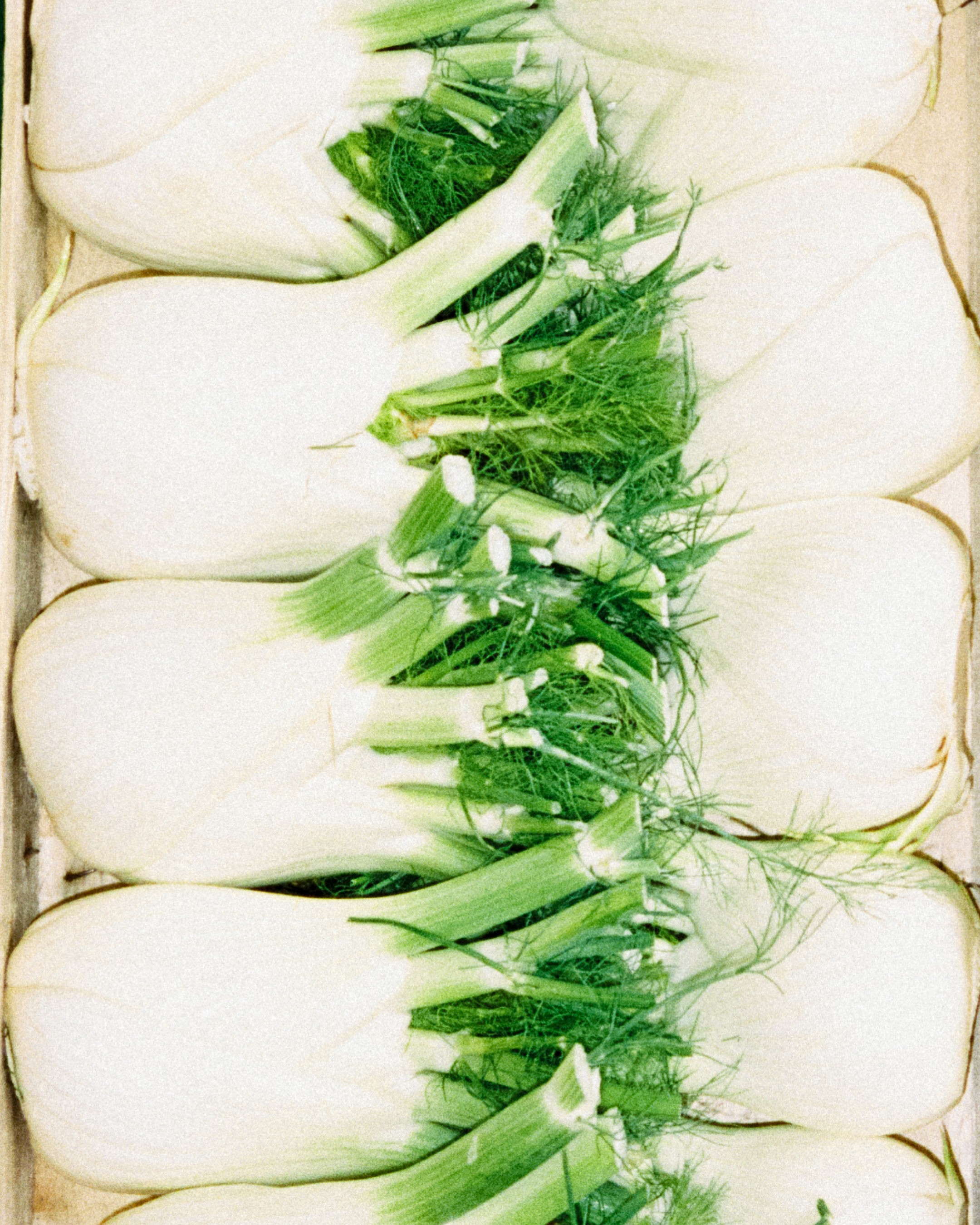
Paired with a bright summer holiday colour palette that blends the vivid hues of fresh produce with the softened, sun-bleached tones of the Amalfi Coast, the identity speaks to both place and personality. Vintage travel posters and faded seaside hotels informed the palette, offering subtle nostalgia without slipping into heritage cliché.
Photography plays a central role. Shot on film to bring textured warmth, it gives La Sovrana a visual voice that feels genuine and flexible as the business grows. These images become more than documentation; they are part of the story itself.
Built for Growth in Every Sense
This rebrand was about more than a logo or a new set of colours. As La Sovrana expands its footprint, we were tasked with creating an identity system robust enough to hold that growth. The wordmark and visual system were designed to scale, not to sit within a rigid template.
To coincide with the launch of the new identity, La Sovrana has also invested in a brand-new warehouse space and a fresh fleet of branded vans, bringing its renewed presence to life across the city. These physical touchpoints anchor the brand in the places where customers encounter La Sovrana every day, reinforcing a sense of intentional movement: from farm, to market, to table.
“The freshness of our produce doesn’t just come from how quickly it reaches the market; it comes from knowing when to pick. That’s knowledge my family has passed down. ”Alfonso Picaro - Founder
Identity That Reflects More Than Aesthetics
For us, this project was a process and a reflection on how authentic branding comes from listening closely to the people and processes that make a business unique. La Sovrana’s identity is not built on abstraction; it is rooted in lived experience: growing and selecting food with care, in time and season, and in the small visual cues that shape everyday life.
In the end, the brand feels proudly Italian yet unmistakably modern, expressive, grounded and full of character. It is an identity that does not simply carry the business forward, it belongs to the world it inhabits.